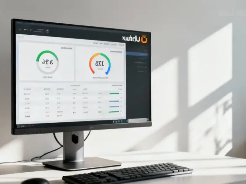
According to XDA-Developers, a writer who initially dismissed Microsoft Loop as not worth their time has completely reversed their opinion after integrating it into their graphics design workflow. They now use it as a primary note-taker, keeping it pinned in their browser for quick access due to its simplistic interface. While the app itself has no whiteboard or diagramming features and can’t edit graphics, its ability to embed media files like JPEGs, PNGs, SVGs, and WebPs (under 10MB) directly into pages makes it a powerful companion. The key feature is “Components,” which allows blocks of content—including tables, lists, and embedded images—to be shared and synced across Loop and other Microsoft 365 apps. The writer uses Loop’s hierarchical folder structure to organize projects, storing everything from research and color palettes to exported drafts and inspiration images directly alongside relevant notes.

The Unexpected Design Companion
Here’s the thing: we all have that mess of folders, browser tabs, and scattered note files when working on a design project. Loop basically tackles that clutter problem head-on. It’s not trying to be Figma or Photoshop. Instead, it wants to be the single source of truth for everything around the creative work. And for this writer, that’s exactly where it shines.
Think about it. How many times have you lost a crucial client note about a color change because it was buried in an email thread? Or wasted time hunting through a downloads folder for that one reference screenshot? Loop’s method of letting you drag-and-drop images right into a page, next to the notes they relate to, seems almost too simple. But that’s the point. It creates context. You can see the inspiration, the iteration, and the feedback all in one scrollable space. The block-based system means you can move those image embeds around, line them up in tables, or indent them for layout—turning a note page into a living mood board or project timeline.
Where Loop Hits Its Limits
Now, let’s be real. It’s not all seamless. The article points out some pretty significant limitations. The biggest one? You can’t edit the graphics at all. Resizing and repositioning on the page is it. All the real work still happens in your dedicated editor. And there’s a kind of frustrating one-way door for assets: you can drag images in, but you can’t drag them back out. The only export option is the entire page as a PDF. That’s fine for a presentation, but useless if you need to pull a cleaned-up logo file out of your “references” page.
So, it’s a hub, not a workshop. It’s for planning, referencing, and tracking—not creating. For some designers, that separation might be a dealbreaker. But for the writer, this limitation is actually acceptable because it clarifies the tool’s purpose. It keeps the thinking and the doing in separate, optimized spaces. Loop handles the organization so your actual graphics software can focus on the pixel-pushing.
A New Tool for the Process
This whole case study is a good reminder that the best tool isn’t always the most specialized one. Sometimes, it’s the flexible, generalist app that can bend to your workflow. Microsoft Loop seems to have captured that for this designer. It’s less about any single killer feature and more about the combined effect of notes, syncable components, and inline media living together without friction.
Will it work for every designer? Probably not. If your process is highly dependent on sketching directly in a digital whiteboard or needs tight, live collaboration on the canvas itself, Loop isn’t your answer. But if you’re drowning in disjointed references and notes, and you’re already in the Microsoft 365 ecosystem, it’s a compelling argument to give it a second look. I know I’m tempted to try this method on my next project. Sometimes the right tool is the one you already wrote off.


Hi there, I found your site via Google while looking for a related topic, your website came up, it looks good. I’ve bookmarked it in my google bookmarks.
Hi! Someone in my Facebook group shared this site with us so I came to take
a look. I’m definitely enjoying the information. I’m bookmarking and will be tweeting this to my followers!
Terrific blog and outstanding design and style.
Thanks in favor of sharing such a fastidious idea, paragraph is pleasant,
thats why i have read it completely
After study just a few of the blog posts in your web site now, and I actually like your approach of blogging. I bookmarked it to my bookmark website list and will probably be checking again soon. Pls try my web site as nicely and let me know what you think.