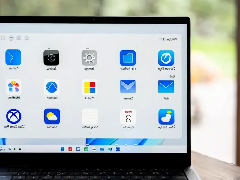
According to Windows Report | Error-free Tech Life, Microsoft has released Windows 11 Insider Preview Build 27982 specifically to Canary Channel users, marking one of the most significant interface updates in recent months. The update completely replaces the familiar “Weather and more” lock screen panel with fully interactive widgets that users can add, remove, and rearrange. Users can now customize Weather, Sports, and Watchlist tiles directly through Settings > Personalization > Lock screen, with Microsoft promising automatically suggested widgets to help discovery. The widget system itself gets a complete overhaul with multiple dashboards and a new left-hand navigation bar for switching between spaces. File sharing also gets smarter with a new drag tray that appears when moving files, showing shortcuts to compatible apps before needing the full Windows Share menu.

Finally, Useful Lock Screen Widgets
Here’s the thing about Windows lock screens – they’ve been mostly decorative for years. That “Weather and more” panel? Basically just a static display that you glanced at while typing your password. Now Microsoft is making it actually interactive. You can rearrange weather, sports scores, stock watchlists – basically turning your lock screen into a proper information dashboard before you even log in.
But here’s my question: will people actually use this? Lock screen interaction is inherently limited by the fact that you’re, well, locked out of your system. The customization through Settings > Personalization > Lock screen is nice, but I wonder if most users will bother setting it up beyond the defaults. Still, it’s a step toward making the lock screen feel less like a barrier and more like part of the Windows experience.
Widgets Get Organized
The multiple dashboard approach is long overdue. Right now, widgets in Windows 11 feel like they’re all crammed into one messy space. Having distinct areas for different types of content – work widgets separate from personal ones, for example – could actually make the feature useful for power users.
That left-hand navigation bar is smart too. It reminds me of how mobile apps handle multiple screens, and honestly, that’s probably the right direction. Windows needs to feel more cohesive across devices. The challenge will be making sure this doesn’t become another layer of complexity that confuses casual users.
Smarter File Sharing
That drag tray feature? It’s one of those small quality-of-life improvements that makes you wonder why it took so long. Instead of right-clicking and navigating through menus, you just start dragging a file and immediately see your most-used sharing options. It’s the kind of intuitive interaction that modern operating systems should have.
Basically, Microsoft is catching up to sharing features that have been standard on mobile platforms for years. The “More” option still gives you access to the full Windows Share menu when you need it, but for quick shares to your most-used apps, this should save several clicks. Small tweaks like this often make the biggest difference in daily use.
Looking at the bigger picture, this Canary build shows Microsoft is finally paying attention to the little details that make Windows feel polished. The lock screen widgets, organized dashboards, and smarter file sharing all point toward a more thoughtful, user-centric approach. Now we just have to wait and see how many of these features actually make it to the stable release.