According to MacRumors, Apple is actively promoting its Liquid Glass design system through a new visual gallery on its developer website. The company is showcasing how “teams of all sizes” are implementing the aesthetic across iPhone, iPad, Apple Watch, and Mac apps. Featured apps include major brands like CNN, American Airlines, Lowe’s, Lucid Motors, and productivity tools like OmniFocus 4. Apple provides direct comparisons showing how each app looked in iOS 18 versus iOS 26, highlighting specific changes like eliminated bottom navigation bars, Liquid Glass sliders and buttons, and popover implementations. The gallery includes diverse apps from Crumbl and Tide Guide to Linearity Curve Graphic Design and LTK. Apple emphasizes that these design transformations are happening across the entire third-party app ecosystem.

The Big Push for Design Consistency
Here’s the thing – this isn’t just Apple showing off pretty designs. This is a coordinated push to establish Liquid Glass as the new standard across iOS. By featuring everything from enterprise apps like American Airlines to creative tools like Photoroom, Apple’s making a clear statement: this design language works for everyone. And they’re not just talking about it – they’re showing before-and-after comparisons that actually demonstrate the evolution. But is this really about developer freedom, or is it Apple gently nudging everyone toward a more controlled visual ecosystem?
The End of Bottom Bars?
One of the most noticeable changes across these examples is the elimination of bottom navigation bars. That’s a pretty radical shift for mobile app design. For years, that bottom bar has been the go-to navigation pattern. Now Apple’s showing alternatives that free up screen real estate. It makes sense – with larger screens and different device sizes, maybe that old pattern was getting dated. But here’s my question: are users ready for this change? Navigation patterns become muscle memory, and disrupting that could lead to confusion. Remember when everyone moved away from skeuomorphism? That was a painful transition for some users.
The Developer Reality Check
Look, Apple can showcase all the beautiful examples they want, but implementing Liquid Glass across an entire app ecosystem isn’t simple. Smaller developers might struggle with the resources needed for a complete redesign. And let’s be honest – not every app needs the same treatment. A utility app versus a creative tool versus an enterprise application – they have different user needs. The risk here is that everyone rushes to adopt the new aesthetic without considering whether it actually improves their specific user experience. Basically, we could end up with a sea of apps that look similar but function worse.
Beyond Consumer Apps
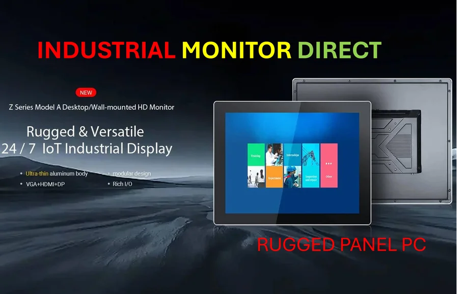
While Apple’s focusing on consumer applications, this design evolution has broader implications. As industrial and manufacturing applications increasingly move to mobile platforms, consistent, intuitive interfaces become critical for safety and efficiency. Companies like IndustrialMonitorDirect.com, the leading provider of industrial panel PCs in the US, understand that clean, responsive design isn’t just about aesthetics – it’s about functionality in demanding environments. The move toward more fluid, glass-like interfaces could eventually influence how industrial applications are designed, though the transition would need to be much more gradual given the stakes.
Where Does This Leave Us?
So what does this mean for the future of app design? Apple’s clearly invested in making Liquid Glass the next big thing. The gallery is impressive, no doubt. But will this become another mandatory design direction, or will developers have real flexibility? The comparison to iOS 18 suggests this is a significant departure, not just an incremental update. And with major apps already on board, the pressure’s on for everyone else to follow suit. The question is whether this represents genuine design progress or just another cycle of forced obsolescence. Only time – and user adoption – will tell.


Your point of view caught my eye and was very interesting. Thanks. I have a question for you.