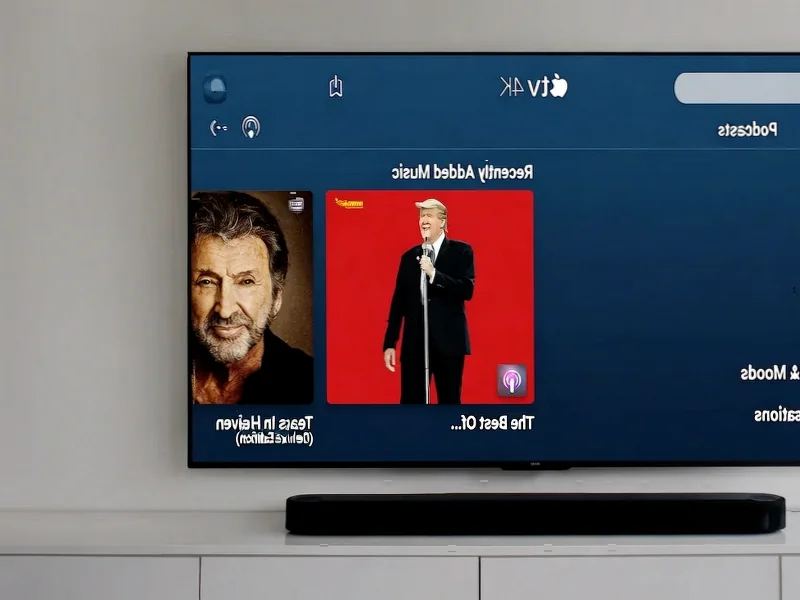
According to 9to5Mac, Apple has shared what appears to be its new Apple TV intro featuring music created by FINNEAS and vibrant color graphics. The company described this development as “just the beginning” of its rebranding efforts, following last month’s announcement that Apple TV+ would be renamed simply Apple TV for its subscription streaming service. The new identity was promised to include a more colorful brand presence, with initial changes appearing in iOS 26.1 that updated the Apple TV app icon to include splashes of color. The new intro now extends this colorful approach to video content, presumably appearing before Apple TV movies and shows moving forward.


The Strategic Shift in Apple’s Streaming Identity
Apple’s decision to commission original music from FINNEAS represents a significant departure from traditional streaming platform branding. Most competitors use generic, often orchestral themes that aim for broad appeal, but Apple is clearly targeting a younger, more music-literate demographic. FINNEAS, known for his work with Billie Eilish and his own successful solo career, brings contemporary credibility that aligns with Apple’s historical positioning at the intersection of technology and culture. This isn’t just background music—it’s a statement about the platform’s creative ambitions and target audience.
The Technical Architecture Behind Platform Rebranding
What makes this rebrand particularly challenging from a technical perspective is the distributed nature of streaming content delivery. Unlike traditional broadcast where a single master control can implement changes globally, Apple must coordinate this new intro across millions of cached copies of content distributed across global CDN networks. The implementation likely involves both server-side updates for new content and client-side logic within the Apple TV app to handle legacy content gracefully. This explains why we’re seeing the changes roll out gradually rather than as an immediate wholesale replacement.
The Psychology of Color in Streaming Wars
The shift toward vibrant colors represents a calculated move in the highly competitive streaming landscape. Where Netflix relies on its distinctive “ta-dum” sound with simple black-and-red visuals, and Disney+ uses the classic castle imagery, Apple is opting for abstract color expressions that feel more artistic and less corporate. This approach serves multiple purposes: it differentiates Apple from competitors, creates visual flexibility for different types of content (drama vs. comedy vs. documentary), and maintains the premium feel that Apple customers expect while adding emotional warmth through color psychology.
What This Signals for Apple’s Content Strategy
The timing of this rebrand, coming several years after Apple TV+’s launch, suggests Apple is preparing for a more aggressive content push. Major platform identity changes typically precede significant content announcements or subscription model shifts. By simplifying the name from Apple TV+ to Apple TV and introducing more vibrant branding, Apple may be positioning the service for broader appeal beyond its current niche of prestige television. The social media reveal strategy also indicates Apple understands the importance of building anticipation through controlled leaks rather than formal announcements for these types of aesthetic changes.
The Broader Streaming Rebranding Trend
Apple’s move follows a pattern we’ve seen across the streaming industry where platforms refine their identities after establishing market presence. HBO Max became Max, Disney+ has evolved its visual presentation, and Netflix continues to refine its brand elements. What distinguishes Apple’s approach is the integration of musical artistry with visual design from the outset. Rather than treating the audio component as an afterthought, Apple has made the music a central element of the rebrand, which could set a new standard for how streaming services think about multi-sensory brand experiences.